The Power of Design and Development: How a CyberSecurity Company Grows Rapidly
Objective

Problems
User experience is the sum total of what a person sees and feels while using a product or service. It is the interaction between the user, the product, and the business. The user experience is everything that happens before, during, and after a person interacts with a website.
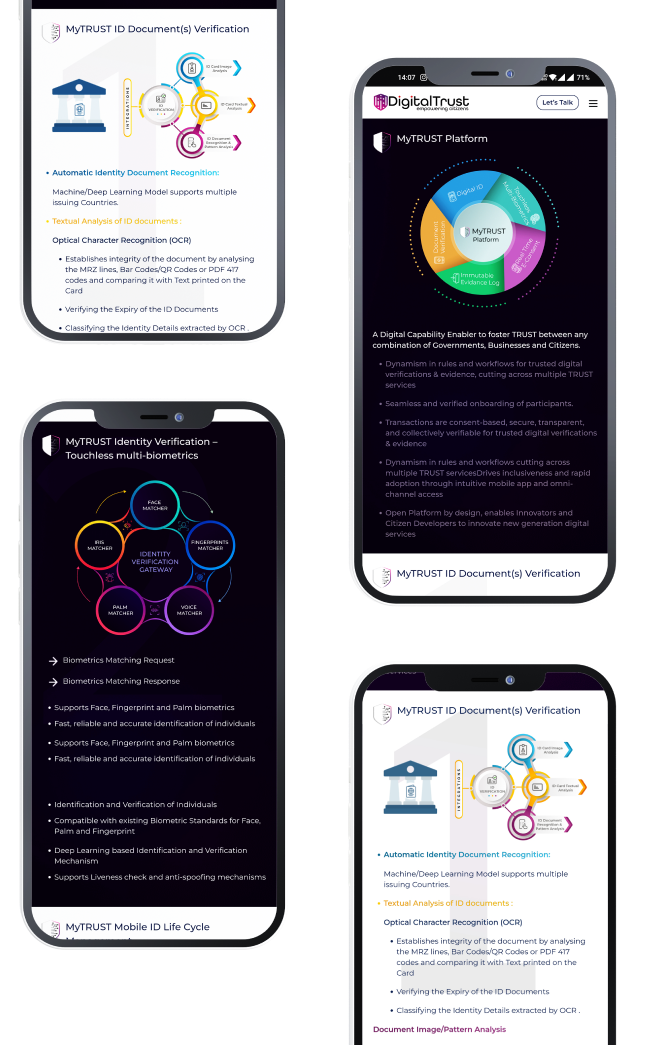
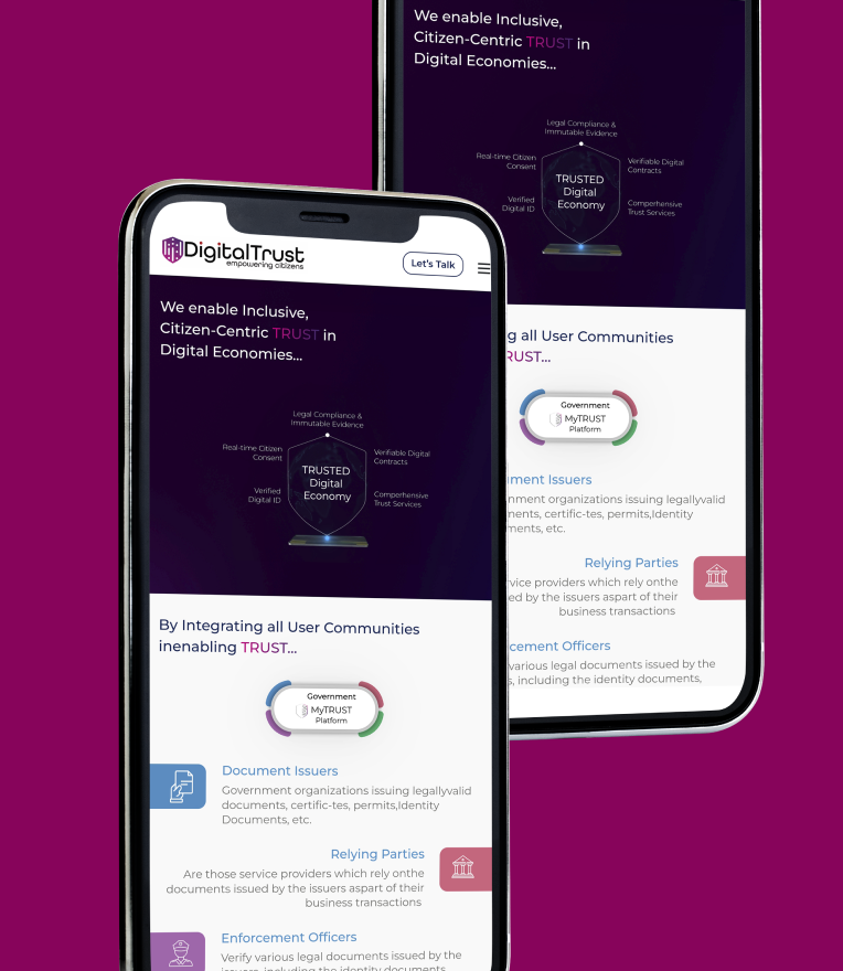
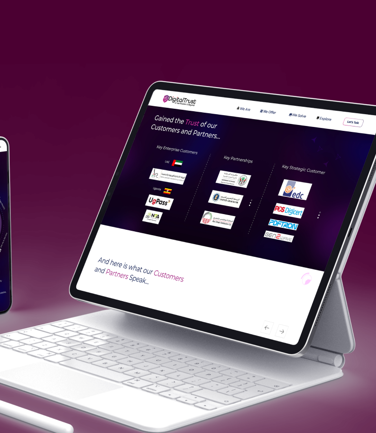
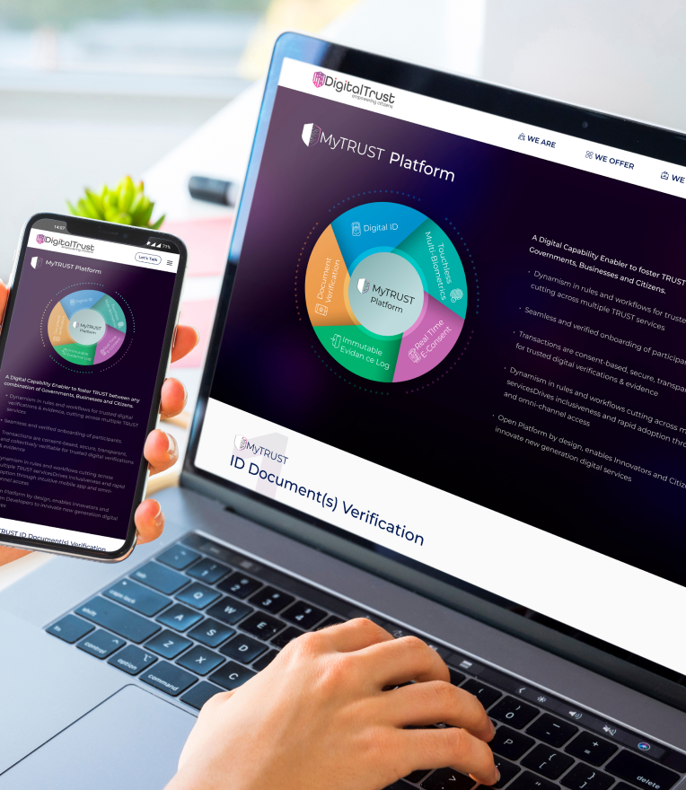
The client had a website with numerous products and services that were difficult to comprehend. They wanted a UI that was attractive, smooth, and rich to show everything they offered. The UI also should be responsive and handle multiple media as well. We collaborated with the client to determine what they wanted and what they did. We then delivered a simple and intuitive UI where process flows are understandable to users immediately.
Challenges
When we first developed DigitalTrust website, we had several challenges to overcome.
First, we had to make sure that the website was clear, concise and easy to navigate. We also had to make sure that the site was accessible for all users.
Second, we were focused on making sure that our solution provided the most competitive UX for services selection. We wanted users to be able to roam around the site and select the best service.
Third, working with a tight deadline meant that we had to work on design and development simultaneously in order to meet our deadline. This made it difficult because every time one group finished working on something they would have to wait another group before they could continue working.
Our Solutions
We at TechEFolks believe in creating beautiful websites that are intuitive, simple, and easy to use. We believe in building websites with love and passion every time we build them for our clients.
This project was made possible by our team’s dedication to designing for usability and user experience (UX) first—no matter what it takes!
We did a lot of research before we started. We talked to the client’s team and got a clear vision of what they needed, which was a website that reflected their business and showcased their products.
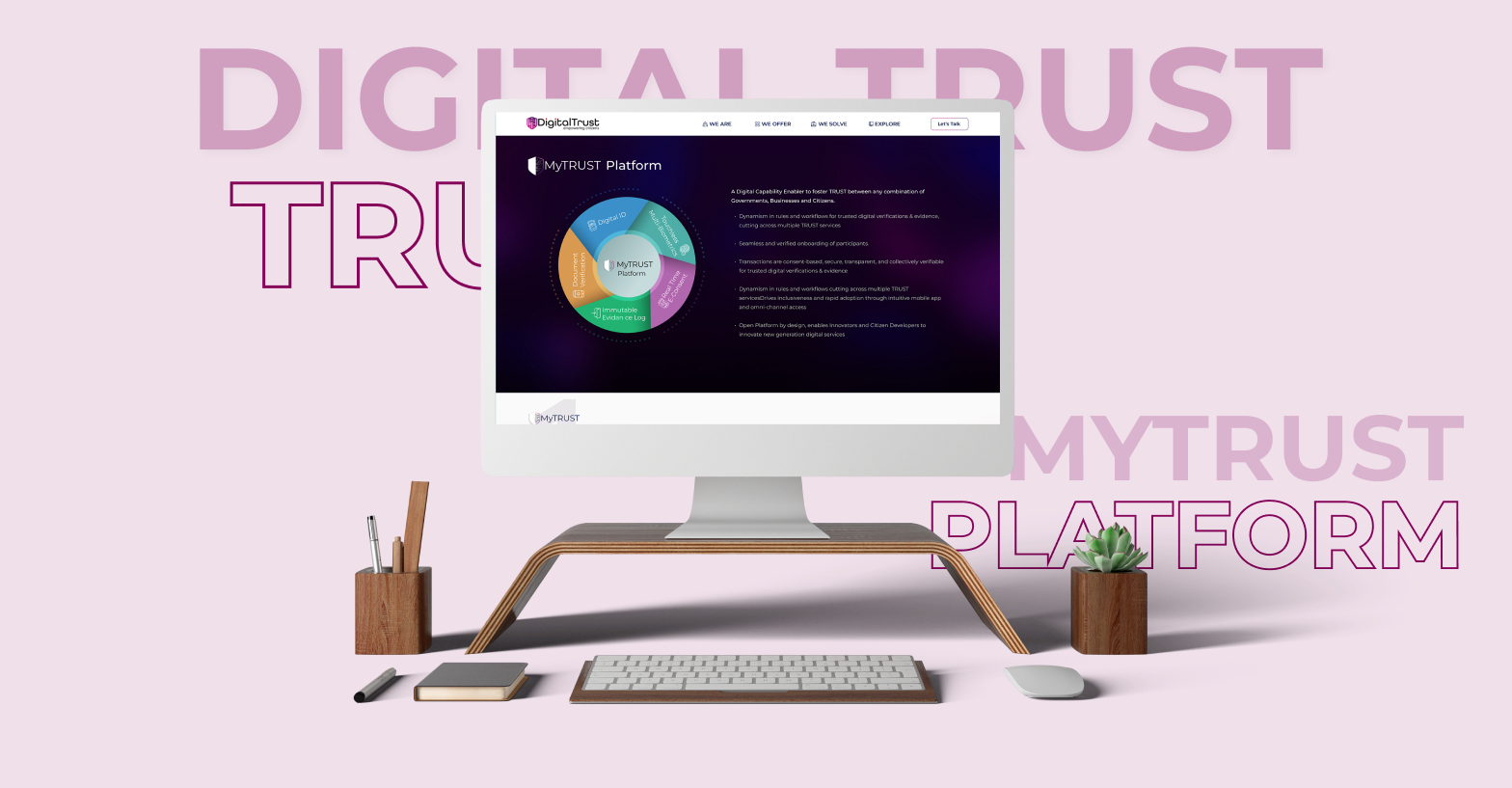
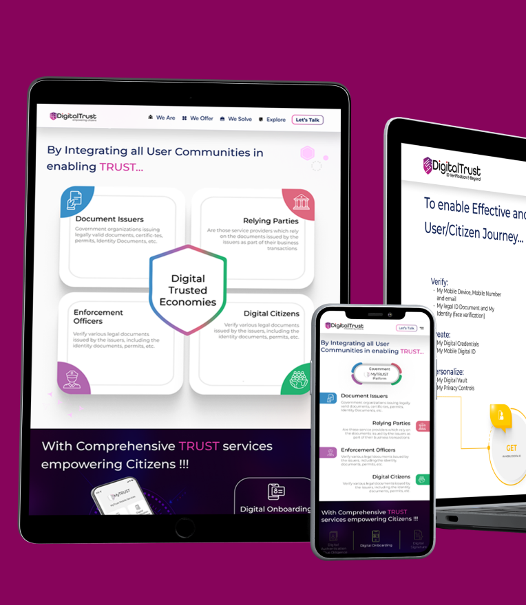
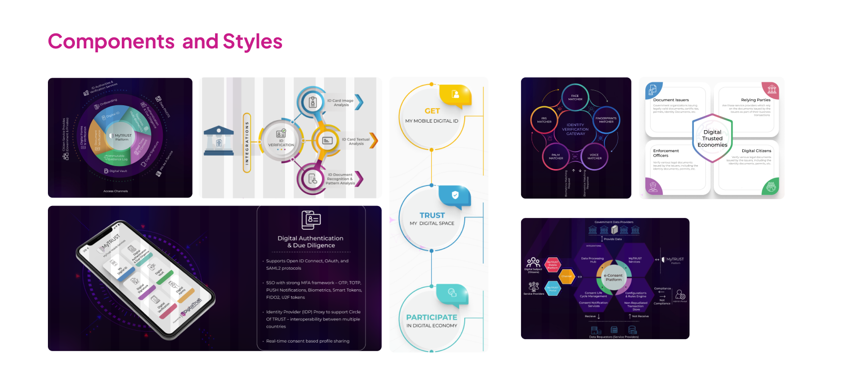
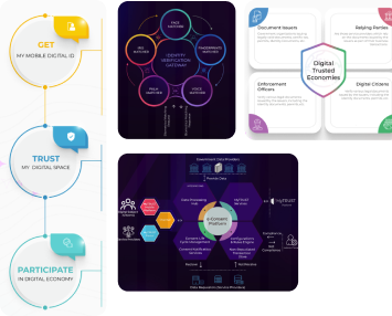
We created a UI that was clean, simple, and easy to navigate for users. We wanted to make sure that users could see the process flows clearly without having to read through text—and we were able to do that!
We worked closely with our clients throughout the development process to understand what they needed and how we could best meet those needs. We also gave them plenty of input into our design decisions so they could feel confident in our work. We have built multiple versions of websites according to the needs of our clients which ensures that they are satisfied with our services.


Approach
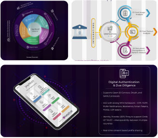
By uncovering and analyzing the core of their business, we were able to restructure the website to be more effective and streamlined. We broke down each page into segments that categorized the visitor’s motivations and needs, and types of service they needed. Additional visual elements on the page help develop a relationship between the user and the business, leading to increased conversions.
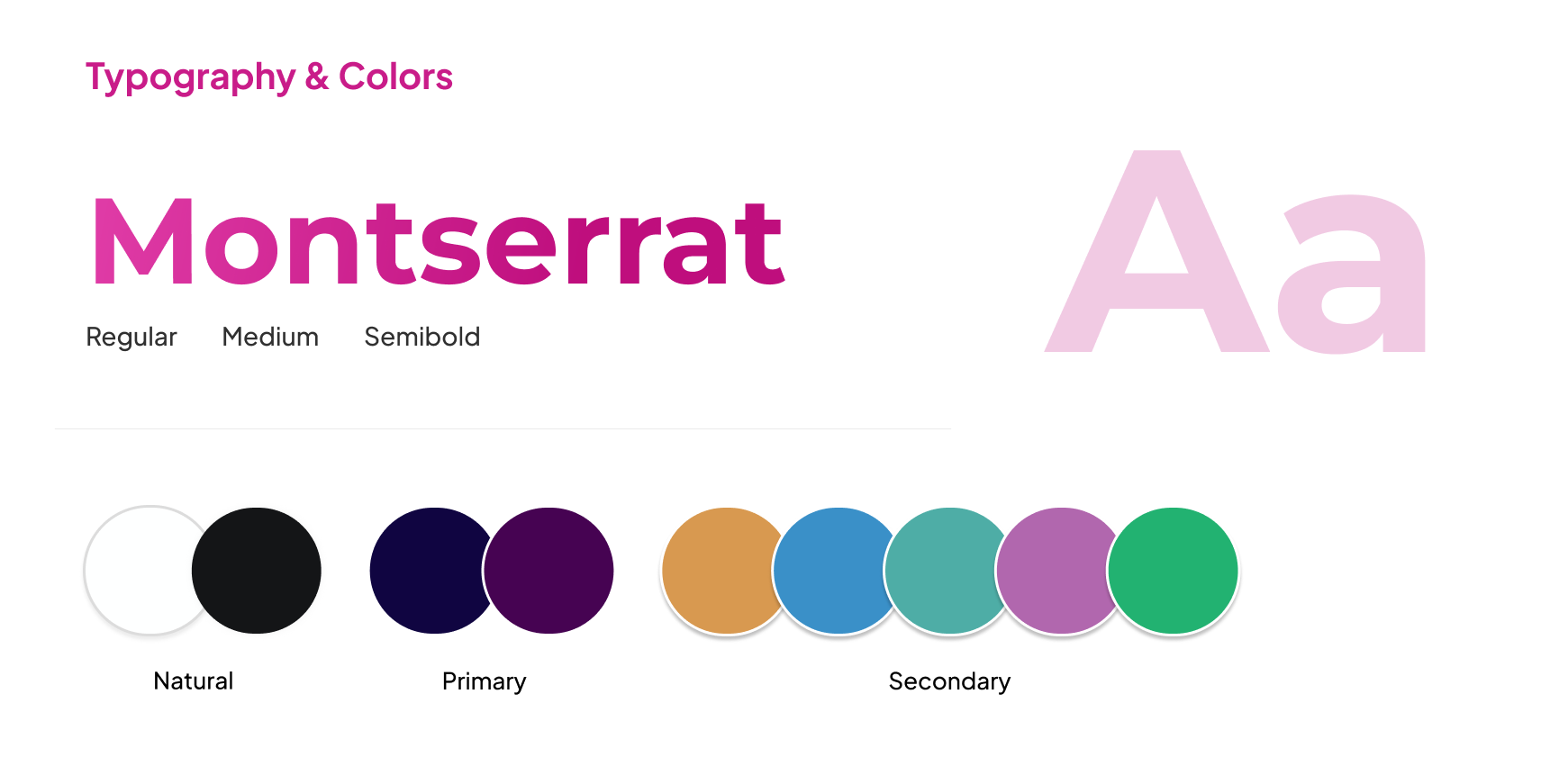
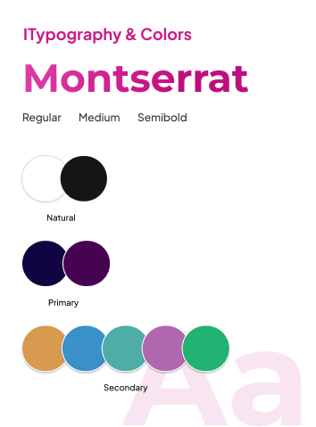
Style Guide
The Outcomes
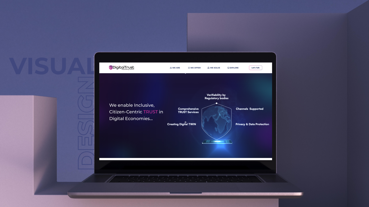
Visual Output
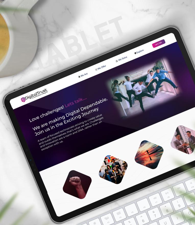
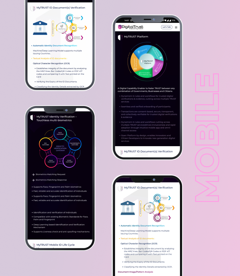
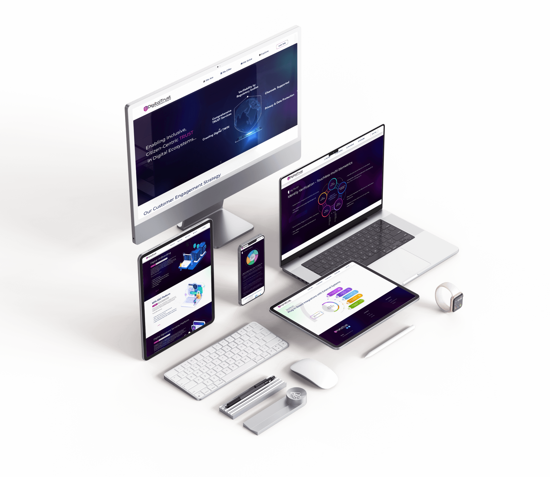
All Screen Design
Lets get started to build great
product with us
